
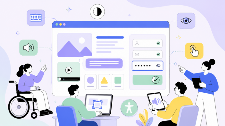
Creating Digital Experiences That Work for Everyone
Website accessibility has become one of the most important considerations in modern digital design. A website is no longer just a marketing tool — it is a central place where people discover brands, purchase products, access services, communicate with companies, and find essential information.
However, many websites still create barriers that prevent millions of people from fully participating online. These barriers can affect people with visual impairments, hearing disabilities, mobility limitations, cognitive differences, and many other accessibility needs.
Creating an accessible website means designing digital experiences that allow as many people as possible to perceive, understand, navigate, and interact with content. It requires thoughtful decisions across design, development, content strategy, and ongoing testing.
In 2026, accessibility is no longer considered an optional improvement. It has become a fundamental part of professional web development, user experience design, and responsible business practices.
A truly accessible website benefits everyone. Clear navigation helps users find information faster. Better contrast improves readability in bright environments. Captions help people understand videos in noisy places. Simple language improves communication for all audiences.
Accessibility is not about creating a separate experience for people with disabilities. It is about removing unnecessary barriers and building a web that works for more people.
What Is Website Accessibility?
Website accessibility refers to the practice of creating websites that can be used by people with different abilities and circumstances.
An accessible website allows users to interact with digital content regardless of whether they use a mouse, keyboard, screen reader, voice control software, magnification tools, or other assistive technologies.
Accessibility includes several areas of user experience.
For people with visual disabilities, accessibility may involve proper color contrast, alternative text for images, screen reader compatibility, and scalable typography.
For people with hearing disabilities, it includes captions, transcripts, and accessible multimedia experiences.
For people with motor disabilities, it means ensuring that websites can be navigated without precise mouse movements.
For people with cognitive disabilities, accessibility often means clear layouts, predictable navigation, simple language, and reduced complexity.
The global standard for website accessibility is the Web Content Accessibility Guidelines, commonly known as WCAG. These guidelines were created by the World Wide Web Consortium (W3C) and provide recommendations for making digital content more accessible.
Most businesses today aim for WCAG Level AA compliance because it represents a practical balance between accessibility improvements and realistic implementation.
Why Website Accessibility Matters More Than Ever in 2026
Accessibility matters for two major reasons: reaching more people and reducing business risk.
According to the World Health Organization, around 1.3 billion people worldwide live with a significant disability. That represents approximately 16% of the global population.
For businesses, this means accessibility directly affects potential customers, employees, and communities. A website that is difficult or impossible to use can unintentionally exclude a large audience.
Imagine a customer who wants to purchase a product but cannot complete checkout because the form does not work with a screen reader. Or a potential client who leaves a website because the text is impossible to read due to poor contrast.
These are not small technical issues. They directly influence customer relationships and business results.
Accessibility is also becoming increasingly important from a legal perspective.
Governments and organizations around the world are introducing stronger digital accessibility requirements. In the United States, WCAG 2.1 Level AA has become a widely recognized benchmark in accessibility discussions and legal cases. In Europe, accessibility requirements have expanded through regulations such as the European Accessibility Act, which requires many businesses providing digital services to meet accessibility standards.
Companies that ignore accessibility risk losing customers, damaging their reputation, and facing unnecessary legal challenges.
The Current State of Website Accessibility
Despite growing awareness, many websites still fail basic accessibility requirements.
Large-scale accessibility research continues to show that the majority of websites contain detectable accessibility problems. Many common issues are not complicated technical challenges — they are basic design and content mistakes that could be prevented during the creation process.
The most common accessibility problems include poor color contrast, missing alternative text for images, unclear links, missing form labels, and incorrect page structure.
These problems often happen because accessibility is treated as something to fix after a website is finished rather than something that should guide the entire design process.
The most successful organizations approach accessibility differently. They include accessibility from the beginning of a project, making it part of their design system, development workflow, and content strategy.
1. Follow WCAG 2.1 Level AA as Your Accessibility Foundation
The first step toward creating an accessible website is understanding and following recognized accessibility standards.
WCAG 2.1 Level AA is considered the practical baseline for most organizations. It provides guidelines covering different aspects of accessibility, including visual presentation, interaction, navigation, and content structure.
Following these standards helps teams create websites that are more usable for people with disabilities while also improving the overall user experience.
However, accessibility should not be viewed only as compliance. A website that technically passes accessibility requirements can still create frustrating experiences if the human experience is ignored.
The goal should always be usability, not simply passing a test.
2. Improve Color Contrast for Better Readability
One of the most common accessibility problems on websites is insufficient color contrast.
Designers often choose colors based on visual style without considering how different users perceive those colors.
Light gray text on a white background may look elegant, but it can be extremely difficult to read for people with low vision. Similar problems occur when important information is communicated only through subtle color differences.
Accessible design requires strong contrast between text and background colors.
Good contrast improves readability not only for people with visual impairments but also for anyone viewing a website on a mobile device, outdoors, or in difficult lighting conditions.
Color choices should balance brand identity with accessibility needs.
A beautiful website should also be an understandable website.
3. Use Meaningful Alternative Text for Images
Images communicate important information, but not every visitor can see them.
Screen readers rely on alternative text, commonly called alt text, to describe images to users who cannot view them.
Effective alt text does not simply describe that an image exists. It explains the purpose and meaning of the image.
For example, instead of writing:
“Photo”
a better description might explain what the image shows and why it matters.
However, not every image needs a description. Decorative images that do not provide meaningful information should usually have empty alt attributes so they do not create unnecessary noise for screen reader users.
Good alt text improves accessibility while also supporting better content structure.
4. Create Accessible Forms With Clear Labels
Forms are one of the most important parts of many websites.
Users rely on forms to contact businesses, create accounts, make purchases, subscribe to services, and complete important actions.
Unfortunately, poorly designed forms often create major accessibility barriers.
Every form field should have a clear label that explains what information the user needs to provide.
Placeholder text alone is not enough because it can disappear when users begin typing and may not always be properly interpreted by assistive technologies.
Accessible forms should also provide clear error messages and instructions.
A user should always understand what went wrong and how to fix the problem.
5. Make Websites Fully Usable With a Keyboard
Not everyone uses a mouse to browse the internet.
Many people navigate websites using keyboards, switches, voice controls, or other assistive technologies.
A website should allow users to access all important features without relying on mouse interaction.
This means users should be able to move through menus, buttons, links, forms, and interactive elements using keyboard controls.
Keyboard accessibility is one of the easiest things businesses can test themselves.
Simply navigate through your website without touching the mouse.
If you cannot complete important actions, many users will experience the same problem.
6. Create Clear Links and Buttons
Links and buttons should communicate their purpose clearly.
Generic phrases such as “click here” provide little information, especially for people using screen readers who often navigate by scanning links.
A better approach is using descriptive language that explains the destination or action.
Buttons should also have clear names.
An icon-only button may look clean visually, but without an accessible label, some users will not understand its purpose.
Every interaction should answer a simple question:
“What will happen if I select this?”
7. Use Proper Heading Structure
Headings are not only visual design elements. They create the structure of a webpage.
Many screen reader users navigate websites by moving through headings, similar to how sighted users scan page sections visually.
A logical heading structure helps users understand content organization.
Pages should begin with a main heading and follow a clear hierarchy.
Skipping heading levels or using headings only because they look visually attractive can create confusion.
Good structure improves accessibility, SEO, and overall readability.
8. Define the Language of Each Page
A small technical detail can have a significant impact.
Websites should clearly identify the language of their content so assistive technologies can pronounce words correctly.
Without proper language settings, screen readers may misinterpret pronunciation, making content difficult to understand.
This simple implementation helps create smoother experiences for international audiences and users who rely on assistive technology.
9. Provide Visible Keyboard Focus Indicators
When someone navigates with a keyboard, they need to know where they are on the page.
Focus indicators show the currently selected element.
Removing these indicators because they do not match a visual design can create serious accessibility problems.
Good design does not hide accessibility features. It integrates them beautifully.
A well-designed focus state can support both usability and brand consistency.
10. Add Captions and Transcripts to Multimedia
Video and audio content have become central parts of digital communication.
However, multimedia without captions or transcripts excludes many users.
Captions support people who are deaf or hard of hearing, but they also help people watching videos without sound, learning in a second language, or searching for specific information.
Transcripts also improve discoverability because search engines can better understand the content.
Accessible multimedia creates a better experience for everyone.
11. Never Depend Only on Color
Color is a powerful design tool, but it should never be the only way information is communicated.
For example, showing an error only with red text may not be enough for users with color vision differences.
Important information should also include text, icons, patterns, or other visual indicators.
This creates stronger communication and prevents confusion.
12. Include Skip Navigation Features
Long websites often contain repeated navigation menus.
For keyboard users, moving through the same menu on every page can become frustrating.
Skip navigation links allow users to jump directly to the main content.
This small feature creates a much smoother browsing experience.
13. Use ARIA Carefully
ARIA (Accessible Rich Internet Applications) provides additional information to assistive technologies.
However, ARIA should not replace good HTML structure.
Incorrect ARIA implementation can create more problems than solutions.
The best approach is using native HTML elements whenever possible and adding ARIA only when necessary.
Simple, semantic code often creates the strongest accessibility foundation.
14. Support Zoom and Responsive Experiences
People with visual impairments often rely on browser zoom.
An accessible website should remain functional when users increase text size or zoom into content.
Layouts should adapt instead of breaking.
Mobile responsiveness, flexible design systems, and scalable typography all contribute to better accessibility.
A website should work comfortably across different devices and viewing conditions.
15. Test With Real Users
Automated accessibility tools are valuable, but they cannot tell the entire story.
A scanner can identify missing alt text or incorrect code patterns, but it cannot understand whether a real person can successfully complete a task.
Human testing reveals problems that automated tools miss.
Watching users interact with a website provides insights into real barriers.
Testing with people who use screen readers, keyboard navigation, magnification tools, or other assistive technologies creates a deeper understanding of accessibility.
The most accessible websites are not created only by following rules. They are created by listening to users.
Why Automated Accessibility Testing Is Not Enough
Automated tools are an important part of the accessibility process.
They help teams quickly identify common technical problems and monitor websites over time.
However, they cannot evaluate human experience.
A tool may confirm that an image has alt text, but it cannot determine whether that description is useful.
It may confirm that a button exists, but it cannot tell whether users understand what the button does.
Accessibility requires both technology and human understanding.
The strongest approach combines automated testing, expert reviews, and real user feedback.
Building Accessibility Into Your Business Strategy
Accessibility should not be treated as a final step before launching a website.
The most successful companies integrate accessibility into their entire digital strategy.
Designers should consider accessibility when creating interfaces.
Developers should build accessible foundations from the beginning.
Content teams should create clear and inclusive communication.
Marketing teams should understand that accessibility expands reach rather than limiting creativity.
When accessibility becomes part of company culture, it becomes easier to maintain and improve.
The Future of Accessible Web Design
The future of the web depends on inclusion.
As technology continues evolving through artificial intelligence, voice interfaces, and new digital experiences, accessibility will become even more important.
The websites that succeed will not simply be the most visually impressive. They will be the ones that understand different users and create experiences where more people can participate.
Accessibility is not only about meeting standards. It is about building trust, expanding opportunities, and creating a digital world that works for everyone.
In 2026 and beyond, accessible websites will no longer be considered exceptional. They will become the foundation of good web design.